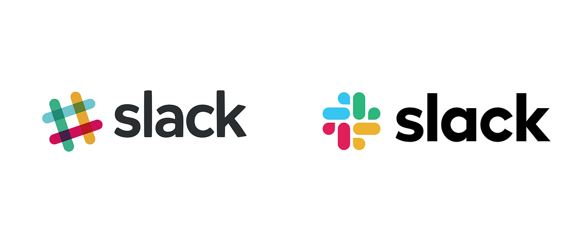
This week, Slack unveiled its new logo. If you’ve been on the Internet long enough, you can easily guess the reaction to that change.
Feel free to grab some popcorn and read the reactions to the announcement. At least some tried to add fun to the mix.

before; after.
Democritus said that “nothing exists except atoms and empty space; everything else is opinion”.
On the Internet, even atoms and empty space are questioned. The Internet is an army of snakes ready to gobble a frog. Too many millennials, I guess. Haters speak louder than fans.
When talking design, your opinion counts even less than usual. So does mine.
Sorry about that.
You know who cares about our opinion? Exactly. Nobody.
Mine doesn’t matter. Neither does yours. It’s just an opinion. I’m not a designer. Even if I was, I don’t know shit about the thought process behind every decision. Even if I did, I also don’t know anything about the context Slack works in.
I wasn’t surprised by the first reaction Slack received. Hopefully, designers who created the logo also weren’t. After all, we have the Internet we deserve, not the Internet we need.
It still shocked me that people held such strong opinions when a company changes its branding. what. the. fuck?!
I might like the old logo better. I also understand that the new one is purer (fewer colors, no rotation). I understand they needed to create a logo that works under more circumstances (black themes, for instance). I might dislike the result of that decisions (I mean, c’mon. Eggplant background? 🍆 wtf).
But I’d refrain from judging people too hard. Especially on topics such as design.
My take is that having an opinion is not bad. At all. But it’s dangerous to have an uninformed one and sell it as informed. An uninformed opinion tends to be biased, full of prejudices, and inaccurate. You’d be doing yourself (and people around you) a favor if you tried to understand things below the surface.
But hey, it’s just my opinion ¯\_(ツ)_/¯.
We are living deep in this whirlpool of shitposts labeled as opinions. We need to have an opinion on everything. On a daily basis. We feel entitled to do so. Tools that we use, code that we read, on everything. And we fail to understand the context that surrounded every decision that got things there.
What if we tried to read and listen more, ask more questions, talk less, and be open-minded? This is my New Year’s resolution.
Form a line!
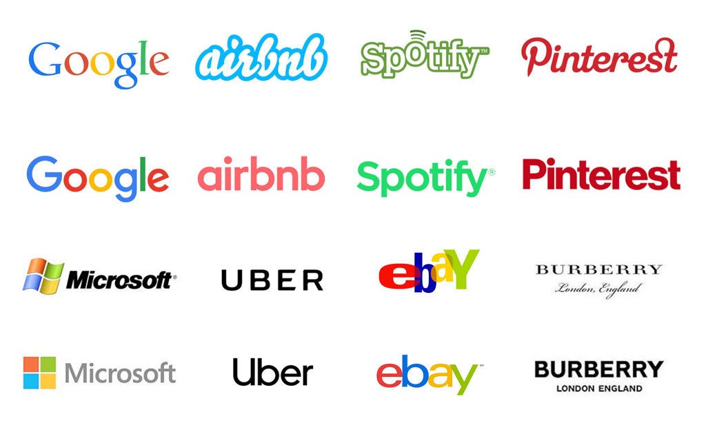
Anyway. The new Slack logo can be described in several ways, but I wouldn’t say it’s new. Is funny to see how trends eat everything for breakfast. A few years back everyone ditched skeuomorphism and complex logos in favor of a minimalist, flat design approach that has swallowed the entire World:

(Image from Just Creative)
By the way, I loved the typography from the old logo.